Genre Research
In this post will be researching about genre in magazines. I'm doing this in order to analyse codes and convection in the texts in order for me to create my own effective magazine piece.

Codes and Convection's:
- Have a review of the movie on the front page, gives insight to the reader about how to feel about the movie/what to expect
- Date and issue number of the magazine written above the Title of the magazine ('Entertainment Weekly') in small writing
- Pictures of the actors overlap the title to make them the main focus, helps them stand out more.
- The umbrella coming out of the 'p' turns back the focus even more towards the actor/actress
- The red hat, bow and 'returns' emphasises the fact that 'Mary Poppins' has returned as it is a very bold colour.
- Price and bar code located on bottom right of the cover
- medium shot
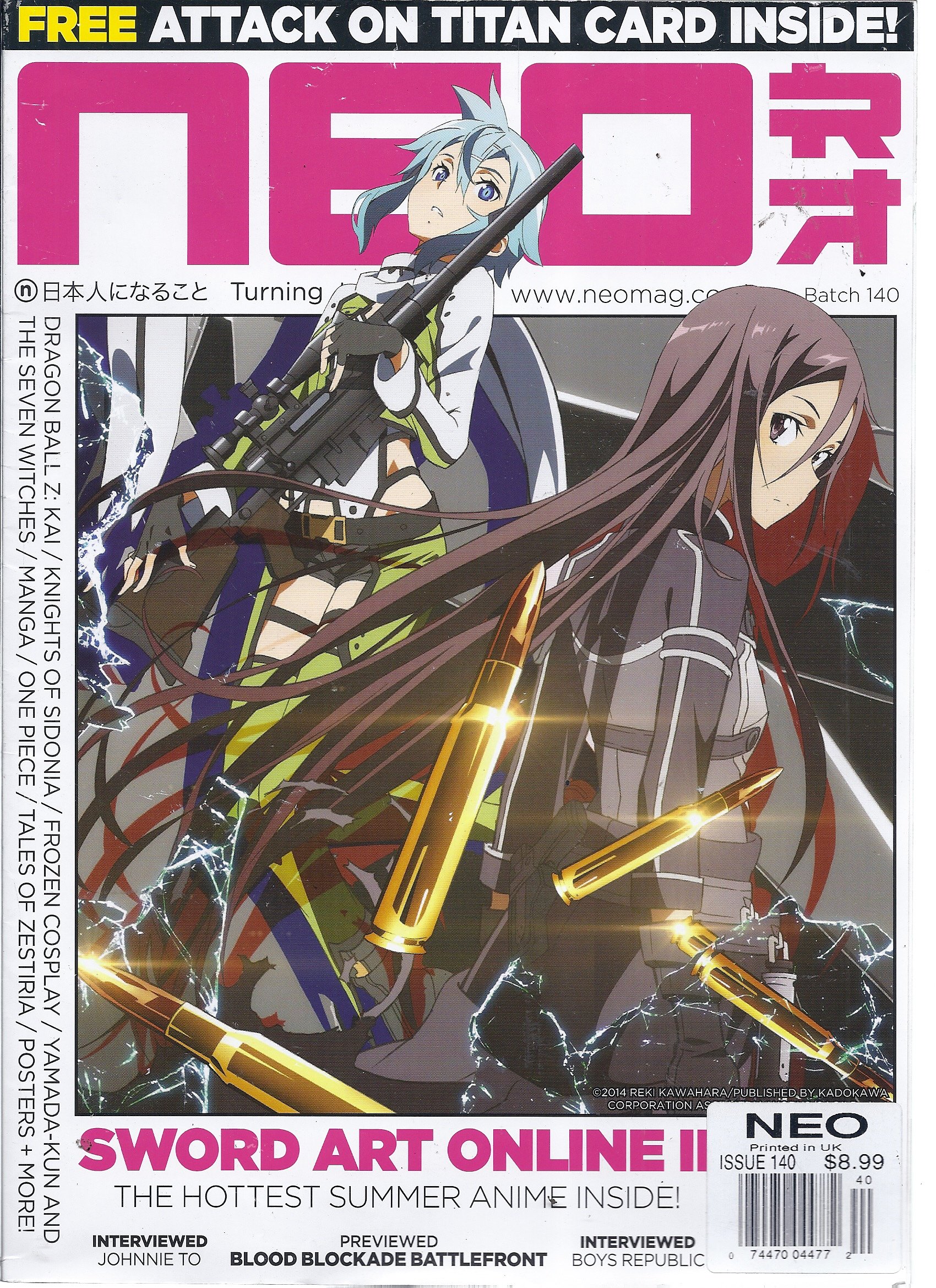
- Magazine cover includes offers that are inside the magazine at the top and bottom of the page
- issue/batch number located underneath the title
- main image overlaps the title to show its importance/ what the magazines main focus will be
- the colour palette (the colour of the title, caption and background) all compliment each other
- bar code and price located at the bottom
- on the left of the magazine it also has written what will be featured inside the magazine, written sideways in order for it to be fitted on the magazine (quite interesting approach i haven't seen this been done before)
- website of the magazine has also been included underneath the title

- issue date located underneath the title in small.
- things that are included inside the magazine is displayed on the front cover
- main topic of the magazine is highlighted in a different colour compared to the rest
- main image overlaps the title
- all the colours used compliment each other
- different types of fonts are used
- low angle shot
Overall, through this research i have discovered that the colour scheme on the front cover of a magazine is important and should compliment each other so that aesthetic is pleasing to look at, issue dates and/or websites are usually located around the title of the magazine and including what is featured inside the magazine is also important. From this i will adapt the way these front covers have managed to make the front cover aesthetically pleasing to look at through the different types of fonts, sizes of texts and colours they editors have used.
S - Good examples of media texts used to establish genre codes and conventions.
ReplyDeleteI - How exactly are you going to use these in your production? Please be specific.
T - See above and include this information in your conclusion in RED FONT please.